A Look at Walls, Patterns, Light, and Spatial Design
I often stay at APA Hotels, and for the past two years I’ve maintained the President status, the highest tier in APA’s membership program.
Because of that, I may be more likely to notice subtle differences between properties, as well as the annual shifts in APA’s design trends.
Have you ever stepped into an APA room and thought:
“This is smaller than I expected… but it doesn’t feel that small.”
Although many APA rooms are compact on paper, the actual experience often feels surprisingly comfortable.
This “perceived spaciousness” may be the result of numerous small design choices that APA uses throughout its rooms.
Wall patterns, the direction of lines, curtain designs, lighting angles, and even furniture alignment—
these elements might be working together to create a sense of openness.
In this article, I’d like to share some observations from my stays and explore how APA may be designing its rooms to feel larger than they are—
not as definitive claims, but as thoughtful considerations based on repeated experience.
- Chapter 1: Four Different Walls — What Might This Mean?
- ① Different Wall Designs May Reduce the “Boxy Room” Feeling
- ② The Geometric Pattern Behind the Bed May Serve as a Visual Anchor
- ③ Horizontal Patterns Near the Desk May Help the Room Feel Wider
- ④ A Simple Entrance Wall Might Serve as a “Visual Rest Point”
- ⑤ Horizontal Curtains and Sheers May Enhance the Sense of Width
- ◆ Chapter 1 Summary — A Question for You
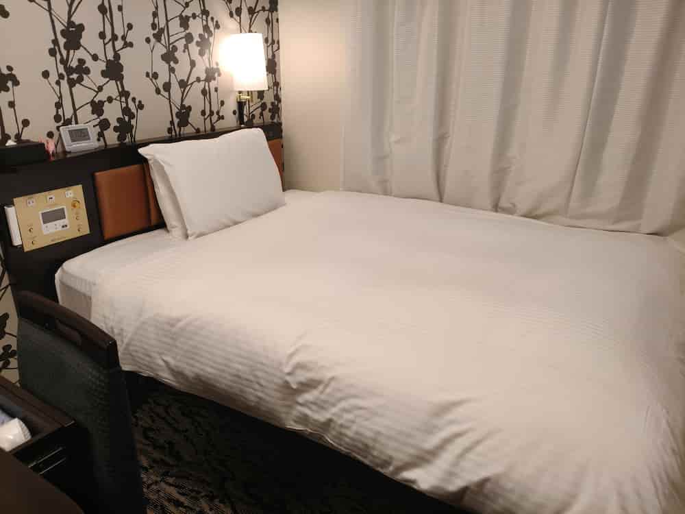
Chapter 1: Four Different Walls — What Might This Mean?
If you look around an APA room carefully,
you may notice that the four walls—
the bed side, entrance side, desk side, and window side—
all have different designs.
If you have a chance to stay again,
try observing each direction intentionally.
You might discover
“I always thought the walls were the same, but they’re actually all different.”
Why would APA choose such a layout?
One possible explanation is that “in a compact space, how the eye moves becomes extremely important.”
① Different Wall Designs May Reduce the “Boxy Room” Feeling
In many business hotels, the same wallpaper is applied to all four walls,
which can make the room feel like a small rectangular box.
APA, however, uses different colors, patterns, or textures on each wall.
As a result, the eye doesn’t fixate on one direction and can move more freely.
This may create a sense of dimensionality,
reducing the feeling of being enclosed.
② The Geometric Pattern Behind the Bed May Serve as a Visual Anchor
The wall behind the bed is often decorated with a geometric pattern.
If you haven’t noticed it before, try paying attention next time.
Geometric patterns tend to draw the eye and can add a sense of depth or even luxury.
Considering that the bed is the “centerpiece” of the room,
placing a distinct pattern there might help stabilize the room’s visual balance.
③ Horizontal Patterns Near the Desk May Help the Room Feel Wider
The desk-side wall often features horizontal lines or textures.
Horizontal patterns are known to guide the eye sideways,
possibly making the workspace feel slightly wider.
Given that APA caters heavily to business travelers,
this could be an intentional choice to create a more relaxed work area.
④ A Simple Entrance Wall Might Serve as a “Visual Rest Point”
The wall near the entrance usually appears more neutral or plain.
This may help calm the viewer’s eye the moment they enter the room,
maintaining balance with the stronger accent walls.
In compact spaces, having at least one “resting surface” can prevent visual overload.
⑤ Horizontal Curtains and Sheers May Enhance the Sense of Width
APA’s curtains and sheer curtains almost always use horizontal patterns.
Horizontal lines can make a window appear wider and emphasize openness.
They may also help distribute natural light smoothly across the room.
This subtle choice could be one of the reasons APA rooms often feel brighter and more spacious than expected.
◆ Chapter 1 Summary — A Question for You
When viewed together, these details suggest that APA rooms might feel larger
because many small visual cues are working in the same direction.
If you stay at APA again,
try spending a moment looking closely at each of the four walls.
What differences do you notice?
コメント